LinkedIn heuristics
A design collaboration for improved usability and flow with the world's leading professional networking app.
UI.UX
Collaboration
Process:
Usability Heuristics, Design Strategy, Brand Guidelines
Scope:
2 weeks
Toolkit:
Figma, FigJam

Connecting 1 billion professionals globally.
LinkedIn is the world's leading business and networking app, currently used by 1 billion people in over 200 countries.
It offers the largest global platform for job seekers to connect with companies and learn in-demand skills with 16,000+ online courses taught by industry professionals.


How can it improve?
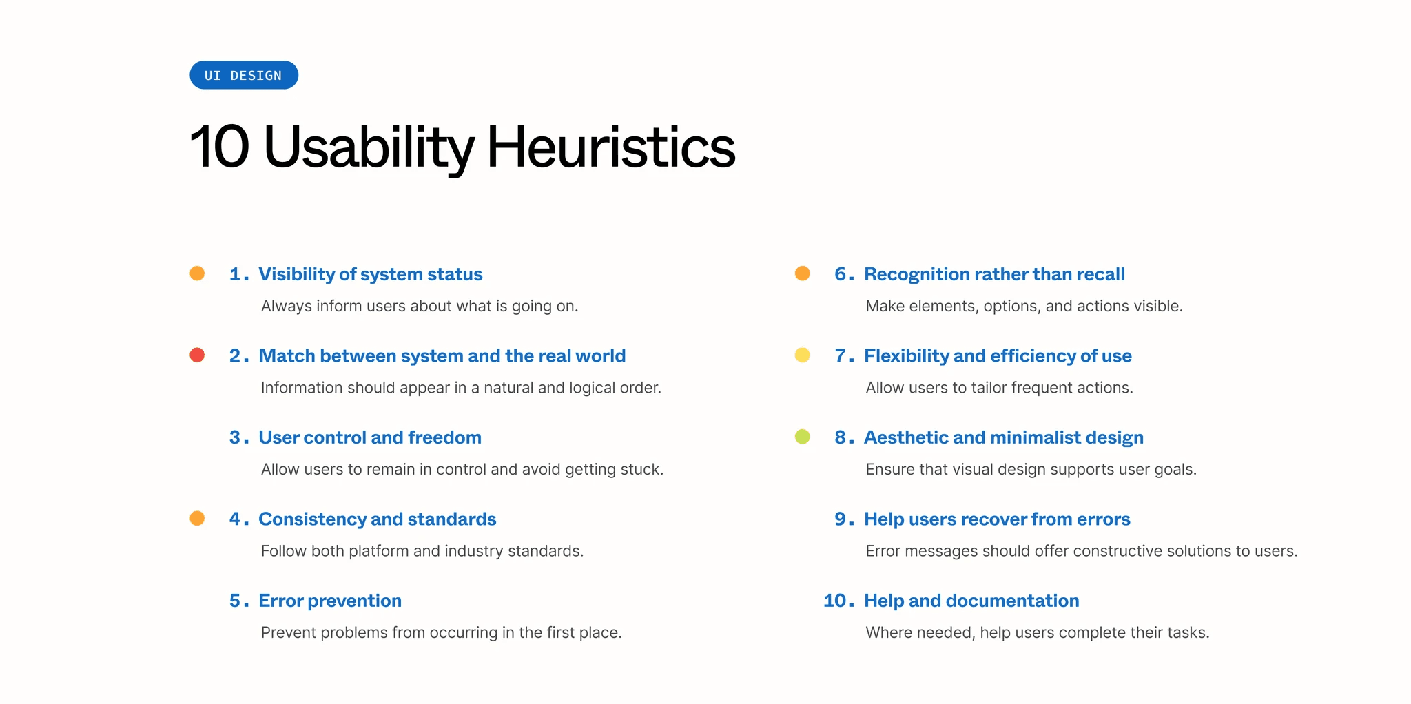
We focused our heuristic evaluation on the mobile user interface for iOS, based on Jakob Nielsen's 10 general principles for interaction design. Following our analysis, we outline targeted solutions to improve usability, simplify design, and engage more users.


LinkedIn Learning
We chose to focus on LinkedIn Learning after encountering challenges navigating its features—one team member was actually unaware of its existence.
Despite LinkedIn’s commitment to online education, our secondary research found that this feature was largely underutilized. There remained an untapped group of users who could potentially benefit from these resources to upskill and achieve their career goals.
Global Value
LinkedIn is worth $16.37 billion in 2025, with 1 billion members in 200+ countries
Learning Asset
$1.5 billion invested into Lynda.com in 2015, now LinkedIn Learning
Untapped Potential
Only 27 million active users take advantage of LinkedIn Learning's 24,000+ courses


Brand Guidelines &
Design
We closely followed LinkedIn's brand guidelines in our proposed redesign, maintaining consistency across colour, typeface, and iconography.
Our design focuses on low-effort, high-impact improvements that streamline an unnecessarily complex user experience—offering a simple and cost-effective solution for LinkedIn to adopt.


Usability in focus
We broke down the main usability issues for LinkedIn's learning feature within the native app, proposing design solutions to improve overall functionality and user experience.


Impact & Outcomes
In the span of a couple of weeks, my partner and I designed a solution to help LinkedIn maximize its $1.5 billion investment in educational resources and cultivate a more engaged learning community.
We began by simplifying navigation to give users a straightforward path to their saved courses, and aligned any aesthetic changes with LinkedIn's existing design language.
Our solution would help users leverage the platform's vast resource library to build new skills and enhance their competitiveness in the job market.


Unlocking the 95%
LinkedIn Learning represents a tiny fraction of the platform's total 1 billion users, however an ultimately straightforward design solution would unlock better integration with the native app and opportunities for greater user engagement across the product as a whole.
Next steps would be to conduct user testing with our proposed solution and further refine any UI changes.
Gathering analytics over 6 months would provide a clearer snapshot of whether the implemented changes are effective at boosting LinkedIn Learning's user base up from 5%—or put another way, unlocking the 95% non-usage rate to create a more engaged and connected community.