charity: water
An end-to-end design solution to strengthen donor engagement and impact for global clean water projects.
UI.UX
Design Sprint
Role:
UI Design, Usability Testing, Visual Identity
Scope:
5 days
Toolkit:
Figma, FigJam
Over a 5-day Design Sprint, my team reimagined the donor experience for the non-profit charity: water, streamlining the giving journey and amplifying the user's sense of impact at every step.

Problem space
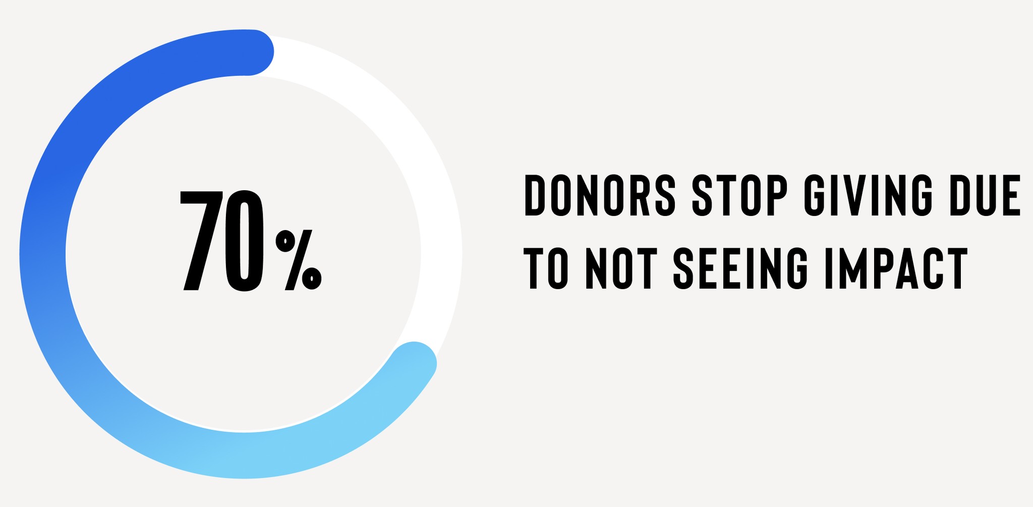
Non-profits face numerous donor retention challenges. 60% of first-time donors don't give again after their initial contribution, while 70% of donors stop giving due to not clearly seeing the impact of their contributions, resulting in declining annual donations.
This highlights a critical need for better donor connection strategies.
Design solution
My team designed a high fidelity prototype for the charity: water main landing page and donation pathway, taking users more seamlessly through the donation experience with a clear call to action rooted in their mission of bringing clean and safe water to communities in need.


Since 2006, the charity has funded over 180,000 clean water projects in 29 countries, impacting 20 million people.
We focused on effective storytelling within non-profits as a strategy to boost donor engagement and increase retention.
User generated content
Authenticity and reach through interactive campaigns
MISSION CLARITY
Reinforcing charity's core mission through clear CTAs
Storytelling
Impactful narratives connecting users with the cause
DONOR RETENTION
Inspiring repeated giving through impact and emotion
Data visualization
Tangible impacts shown through strategic visuals
DIFFERENTIATION
How the charity is unique from its competitors
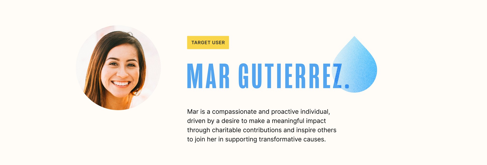

We interviewed five individuals who had previously donated to charities and were passionate about supporting causes both locally and globally. We explored their motivations for giving and the barriers that might discourage them from donating or lead them to stop supporting a charity.
Users were deeply influenced by compelling storytelling that clearly demonstrated how their contributions made a tangible impact. Transparency and trustworthiness in how charities used funds were critical factors in donor decision-making.
These insights shaped our persona, with a focus on designing a user experience that enhanced trust and storytelling to support long-term donor retention.


Illustrations by Sofia Ramos
Usability analysis
With this question in mind, we evaluated the usability of charity: water's landing page and donation experience based on the user journey of our persona, Mar.
Main usability issues included:
Complex and inconsistent nav that changed based on the user's entry point to the website.
Donation ask appearing before the user has the opportunity to learn more about the charity with proof of its meaningful impact.
Disconnected and uninspiring narrative that breaks up important information in separate content blocks with too many CTAs.

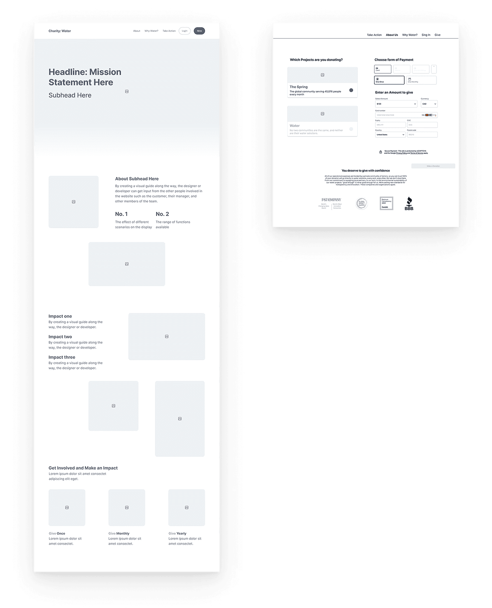
Wireframing
Our team developed two sets of wireframes for the main landing page and donation process.

Testing & Refining
We followed up with one round of usability testing, asking users to make a one-time donation as a new visitor to the site:
Browse through the landing page
Select the option to make a one-time donation
Fill out payment form
Confirm payment
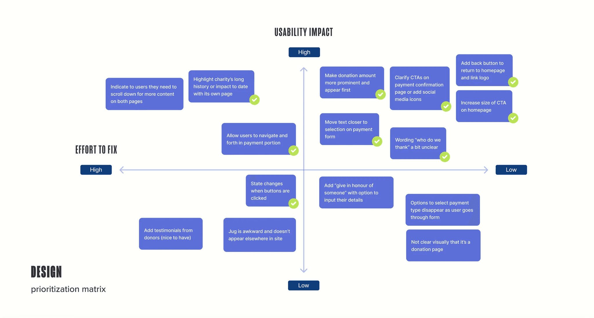
Users identified pain points mainly surrounding the clarity of the overall donation process and a need to enhance visibility of impact.
We plotted feedback out on a design prioritization matrix to focus on the most high impact usability improvements for the final prototype within the time constraints of the design sprint.

Moving to high fidelity
We took Charity: water's core brand guidelines into careful consideration when moving to high fidelity. Their brand consists of both rich and soft tones, always alongside the iconic yellow Jerry Can of their logo.


Visual design approach
We explored key branding elements—typography, colour, and imagery—to craft a cohesive and compelling visual identity.
Leveraging their core brand assets, we refined the existing design while introducing custom elements to enhance consistency across all pages.
To strengthen the connection to the organization’s mission, we proposed a more vibrant, water-inspired color palette to bring a feeling of renewed energy to the brand and reinforce the hero message "Every drop transforms lives."


Our solution
We redesigned the landing page for a more seamless user experience, guiding donors through impact highlights with clear storytelling, transparent donation options, and more intuitive navigation.


Visual design
Our team designed the landing page in a fluid style to reference the water-inspired theme, and guide users through the charity's mission and global impact as a seamless experience.
Potential donors can now easily explore programs, see exactly how their contributions make an impact, and choose from multiple giving options—fostering trust, deepening engagement, and encouraging lasting generosity.


Outcomes
Emotional connection and trust were the strongest motivators for users to donate and while charity: water offers compelling content—images, stories, and impactful results—a lack of clear narrative limits its potential to attract new donors and retain existing contributions.
Further usability improvements:
Enhanced visual storytelling with testimonials, videos, and multimedia elements.
More user testing to evaluate impact of new visual identity.
Expanded content with their story and timeline to reinforce credibility.