Marketing skinsight
Engaging new subscribers with safe and effective routines that intelligently combine skincare + product analytics.
UI.UX
Michelle Murvai
Process:
UI Design, Content Flow, Responsive Design
Scope:
2 weeks
Toolkit:
Figma

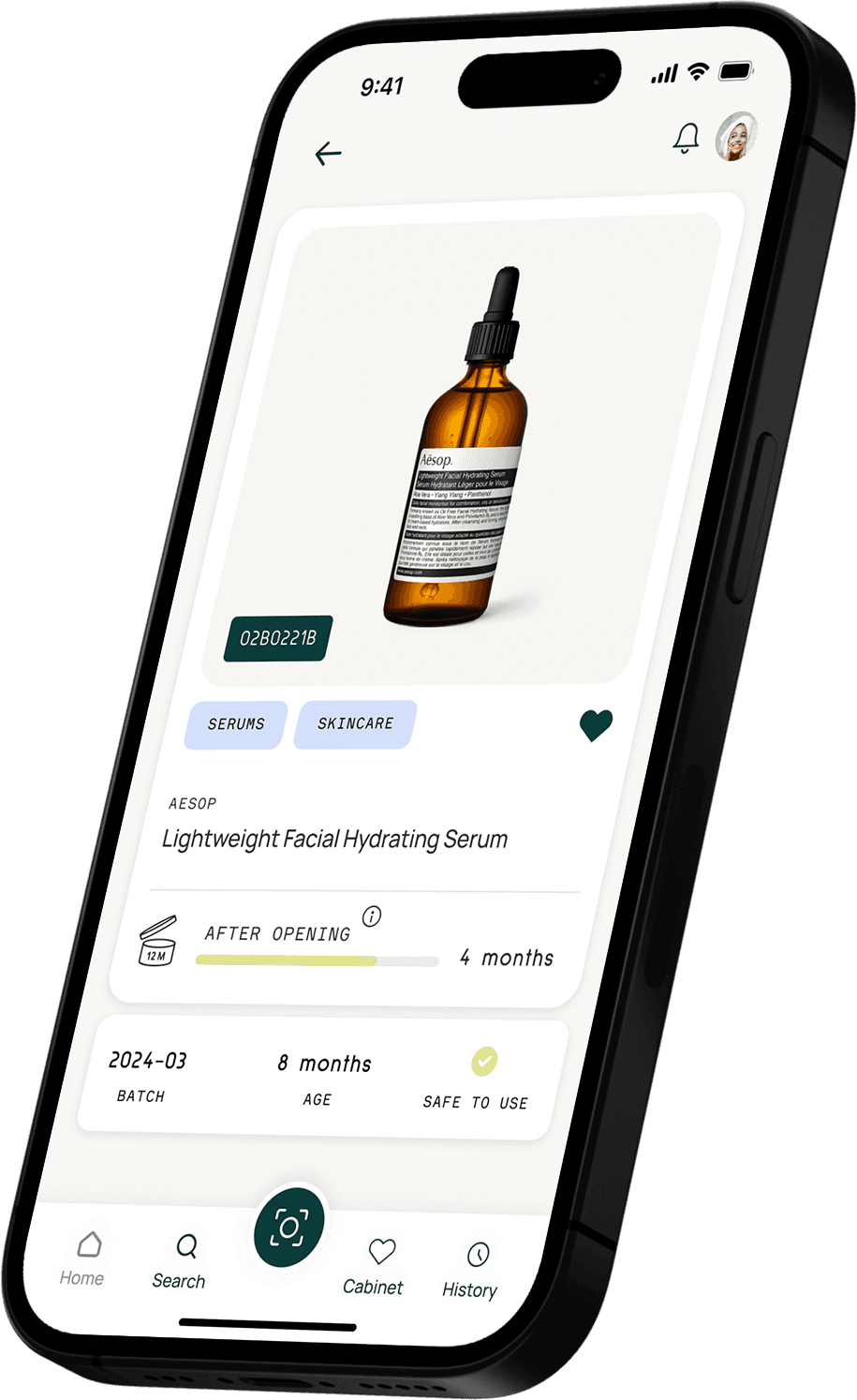
Skinsight is a mobile app that helps users stay on top of their skincare by scanning batch codes and tracking expiry dates—with the idea that great skincare routines start with fresh, effective products. The marketing page was designed to showcase key features, build trust through clear visual storytelling, and ultimately drive downloads through compelling CTAs and strong social proof.


Visual direction
I began developing the landing page design by extending the app’s visual language for the web, ensuring responsiveness and consistency across devices.
My inspiration drew on the app's open, breathable layouts and fresh colour palette to create a feeling of light visual weight balanced by vibrancy and calm—reflecting the brand's keywords clean, minimalist, and softly vibrant.

Moodboard
Next, I expanded further on the visual idea of openness in my moodboard, a design reference to the “open jar” symbol found on PAO (Period After Opening) labels.
By emphasizing this concept of freshness, the design was able to bridge brand personality with UI direction through subtly reinforcing the idea of using products at their peak effectiveness.

Content that breathes
Mood and messaging aligned, I created a content flow diagram that mapped how information would behave across breakpoints for desktop and mobile. The goal was to keep the structure consistent while adapting the experience, ensuring usability regardless of screen size.


Wireframes
Wireframes followed, starting in grayscale to focus on hierarchy and flow. These provided a clear foundation before moving to high fidelity, keeping the architecture intact while refining type, layout, and visual rhythm.

Moving to hi-fi
Using the app's existing design system, I developed high fidelity prototypes for both desktop and mobile. Typography, colour, and imagery were kept consistent and applied with intention to guide attention and reinforce brand tone.
Skinsight's landing page is designed to feel like a natural extension of the app itself—intuitive, vibrant, and highly usable.

Refining usability
To refine the experience further, I tested two versions (A and B) of the desktop and mobile pages. Version A was the preferred option, accompanied by feedback around flow, visual balance, and content hierarchy.
From there, I implemented these key improvements:
Adjusted product mockups for more natural angles
Standardized colour and type scales between sections
Moved the brand logo banner below the fold to encourage scrolling


More A, less B
Overall, version A (or 1 ) was the more popular choice, with some feedback to improve design and flow. I prioritized the most impactful changes, improving mockup perspectives and angles, creating consistency in colour and typescales between sections, and moving the brand logo banner beneath the fold to prompt visitors to scroll down.


Final design
The final landing page mirrors the in-app experience—fresh, clear, and easy to navigate. Visitors are naturally guided through supporting sections blending storytelling, vibrant visuals, and actionable CTAs, that reinforce brand trust and encourage downloads.


Next steps
This project highlighted the importance of an iterative, open-ended design process for me—flexible while staying aligned with my product’s core mission.
Next, I’d like to explore micro-interactions and subtle transitions to introduce moments of delight, used sparingly and with purpose. I see this added interactivity as a type of visual punctuation, expressing design language in a way that feels both intuitive and polished as it guides user flow.
My goal was to lay the groundwork for a growing community of skincare lovers—promoting safer personal care routines, less product waste, and stronger user engagement.
